Redesigning a Therapy Platform to Work for Everyone
Balancing provider needs with a streamlined client experience
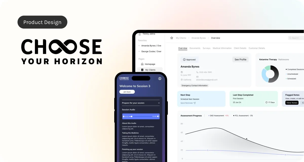
This project focused on redesigning a mental health platform that was originally built for a single use case: ketamine therapy. The first version of the platform was clunky, confusing, and difficult to navigate. Therapists couldn’t track client progress, and clients had no way to revisit past sessions. The system lacked flexibility and didn’t support how real clinics operate.
Our goal was to turn it into a more adaptable platform that supported multiple therapies, worked for both therapists and clients, and felt intuitive across devices.
Where We Started
The original platform had two core issues:
The user experience was frustrating and difficult to navigate.
It only supported one type of therapy, which made it too limited for broader use.
There were also no tools for therapists to take notes, update client records, or track progress over time. That gap made it hard to provide consistent, personalized care.
What We Changed
We focused on solving the most critical problems for both sides of the platform:
For therapists: We introduced note-taking, client progress tracking, and easier ways to keep records up to date.
For clients: We added access to past sessions, support for multiple therapy types, and a more streamlined way to submit forms and documentation.
We also restructured the design to support multiple treatment paths while keeping the interface clean and easy to use. Simplicity guided every decision.

Collaborating Directly with Therapists
To avoid guessing what therapists needed, we spoke with them directly. Through interviews and feedback sessions, we identified their top priorities and pain points.
One of the biggest takeaways was that the original dashboard felt too complex. It also posed challenges for developers. We simplified the layout, clarified the information hierarchy, and focused on creating a system that was easier to use and easier to build on.

Mobile-First, But Not Mobile-Only
About 80% of users access the dashboard from their phones, so we made mobile usability a key priority. This case study features desktop layouts to show more information at once and to keep the visuals simple and clean for presentation.

What I Learned
This project showed me the value of listening early and often. Interviewing therapists and clients separately helped us understand the different ways they interacted with the platform and revealed what mattered most to each group.
It also reinforced the importance of designing with flexibility in mind. Expanding from a single therapy to a multi-product platform required us to rethink the structure and flow of information. By focusing on real user feedback and continuous iteration, we created a design system that can scale and evolve alongside the product.
