Building Loyalty Through Membership Design
Designing for premium loyalty, retention, and connection
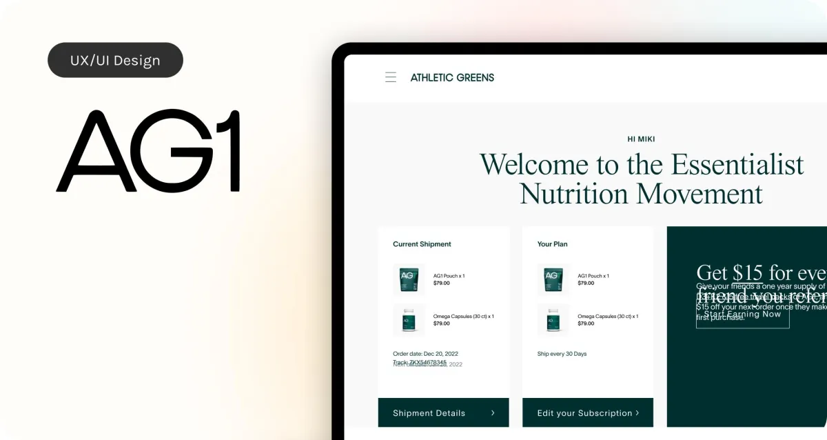
AG1 is positioned as a premium daily health drink, priced around $80 for 30 servings. While the product delivers a high-quality experience, the original member dashboard did not reflect that same level of care. It was functional but sterile, lacking the personality, polish, and emotional value that users expect from a premium brand.
My goal was to elevate the platform to reflect AG1’s values and engage members more deeply. The redesigned experience needed to go beyond utility and reinforce brand loyalty at every touchpoint.

Understanding the Opportunity
The existing portal didn’t make users feel valued. It didn’t reflect the premium nature of the product or offer any sense of community or personalization. We saw an opportunity to create a dashboard that felt tailored, refined, and consistent with AG1’s mission of health made simple.
To inform the redesign, we studied competitors like Gainful, Prose, and Care/of, all of which offer strong, premium user experiences:
Gainful impressed us with its personalized nutrition plans and access to expert support.
Prose stood out for its deep customization options based on user preferences.
Care/of integrated wellness tracking to help users connect their supplements to long-term health goals.
These examples helped shape our feature set and guided us toward a more engaging, premium-feeling design.
Building a Better Member Experience
Our team focused on creating a dashboard that increased retention and reinforced AG1’s brand values through thoughtful content and structure.
Highlighting Benefits
We emphasized AG1’s mission-driven initiatives, such as feeding a child with every order and offsetting carbon emissions. These values were woven directly into the dashboard to strengthen customer connection.Strategic Perks
We introduced small, well-timed perks to surprise members and reduce churn. These moments were designed to feel intentional and rewarding, not gimmicky.Guided Onboarding
We created a simple, step-by-step onboarding flow to help users build confidence and make AG1 a habit. The structure gave users a clear sense of how to start and what to expect.
Three Portal Versions, One Core System
To explore different user needs, I designed three versions of the portal. Each one maintained consistent architecture but emphasized different priorities:
Version 1: Utility-Focused
This version made subscription management and referral access effortless. It also prioritized instructional and educational content to support daily use.Version 2: Lifestyle-Driven
This layout appealed to users who saw AG1 as part of a larger wellness routine. The design was clean and aspirational, with a strong focus on habit-building.Version 3: Impact-Centered
Built for users who care about brand mission, this version showcased AG1’s health benefits and social responsibility efforts. It provided a broader view of product value while keeping the subscription flow clear.

What I Learned
Designing for a premium audience means more than visual polish. It’s about reinforcing brand trust, highlighting values, and making the experience feel thoughtful and human at every step.
This project reinforced how different users connect to a brand in different ways. Some value clarity and control. Others care about mission or daily lifestyle. All of them need a system that feels responsive and rewarding.
By testing multiple versions and listening to real user feedback, we were able to identify what created the strongest connection and delivered the most value. The result was a flexible, premium platform that supports retention while staying true to AG1’s core purpose.
